Rob,
No the job was crap but it proved the concept.
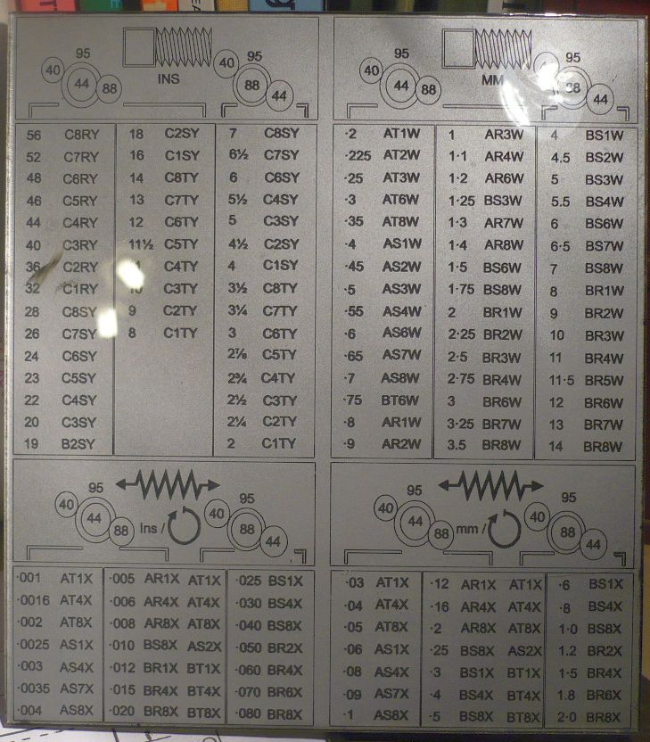
The reason it darker bottom right is the plate warped with the heat and curled up, this then altered the focal length of the beam so you get fatter letters which hold more black.
same at the top as it did all the lines and circles first, then went on to do the lettering. The last lettering to do was at the top and because of the curl it's missed the circles.
Best example is the middle of the plate except the two last lines as I tried to see if it would push down and moved the plate.
When I do them not I pin them to a big block of alloy and do the lettering in stages to allow the heat to dissipate.
Another way of doing these is to take a sheet of normal perspex, spray the back silver using a Willco rattle can, burn the image on the back in reverse, then rattle can it black.
This gives you a nice plate and smooth on the front so the lettering can't wear off.
